
The amount and complexity of information produced in business, science, engineering, and everyday human activity is increasing at staggering rates. This course for professionals will expose you to visualization techniques and best practices that will enable you to efficiently communicate complex data.
Visualization for data discovery and communication is an important part of the data science pipeline. Good visualizations not only present a visual interpretation of data, but do so by improving comprehension, communication, and decision making.
In this course your team will learn how to read, design, and build visualizations to effectively communicate your data! We tailor the course to the needs of our clients. Among the topics we can cover:
- Fundamentals of perception.
- The theory of visualization.
- Good design practices for visualization.
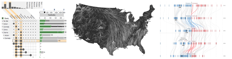
- How to visualize tabular data, networks and geospatial data.
- Communicating data and telling data-driven stories.
- How to use interaction techniques.
- How to design visualizations in a user-centered process.
We also offer modules targeted at a technical audience:
- How to develop your own interactive, web-based visualizations using HTML5, CSS, JavaScript, SVG, D3, and Vega.
- How to wrangle and visualize data in Python or in R.
- How to visualize Data with Tableau.
Another option are consulting sessions where we provide advice on how to tackle specific data analysis and visualization problems in your organization.
Course Organization
Depending on the modules chosen, the course lasts between half a day and two days. The theoretical modules consist of lectures, interspersed with exercises such as design critiques, sketching, rapid prototyping, task analysis etc.
Technical modules are supported by a live-coding environment, where participants can follow along with the instructor and try out variations and new ideas on the spot.
E-Mail vdl-faculty@sci.utah.edu if you are interested in organizing a course for your organization.
Instructor

The course is taught by Alexander Lex, a visualization professional and faculty member at the University of Utah. Alex directs the Visualization Design Lab, a visualization research group at the SCI Institute. The lab develops novel visualization solutions for scientists in both academic and industry settings.
Alex has taught visualization courses for more than ten years, including at Utah, Harvard, and for various corporations. Before joining the University of Utah, Alex has completed a PostDoc at Harvard.
Alex has developed many widely used open-source visualization techniques (for example, UpSet) that have been adopted, e.g., by Microsoft in their PowerBI platform or are in use both in academic and commercial research labs. He has won numerous awards, including multiple best paper awards or honorable mentions at visualization conferences and a best dissertation award from his alma mater. Alex is also a co-founder of Datavisyn, a data visualization company that serves the pharmaceutical industry.
Depending on the course content, Alex will team up with members of his lab, which includes professional software developers, PostDocs, and students.
Previous Clients
Previous clients include Walmart, ARUP Laboratories, and the University of Utah Health Sciences.